Forest Friends and Website Store Launch

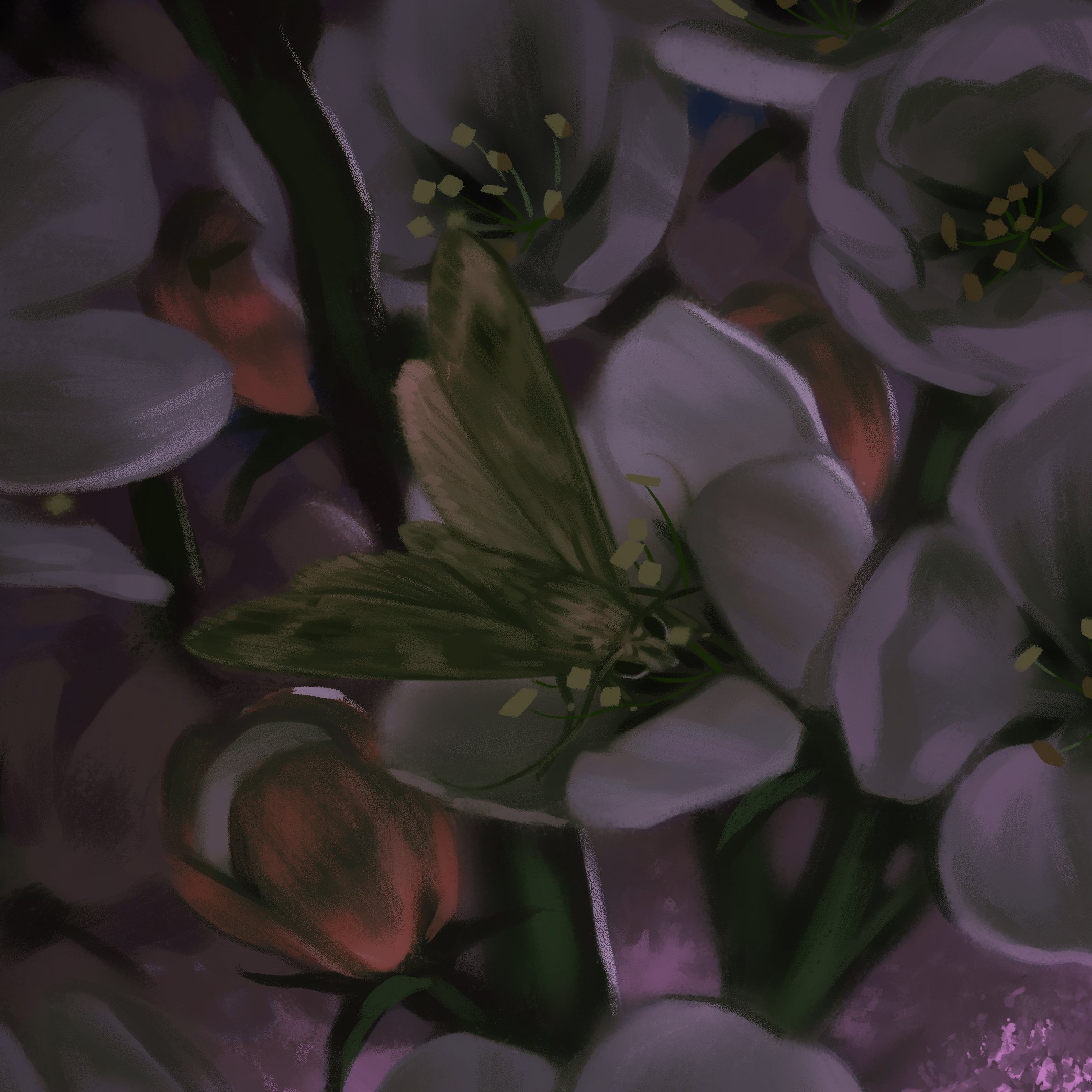
One of my goals is to create more art that is part of my own creative vision, characters, and stories. Although I love working on book covers, there are some constraints with subject matter and designing for marketability. After doing some art with animals, I realized that they provide a certain freedom that I don't find with figurative human-based work and are a great jumping off point. Expect more forest friends in the near future!

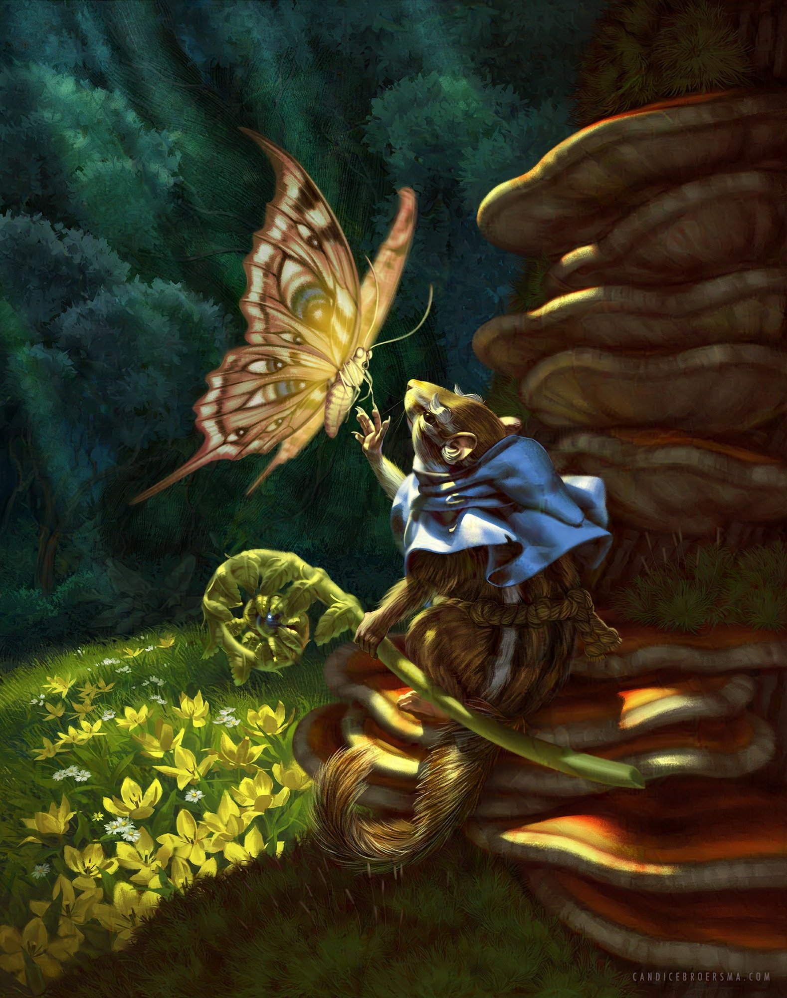
 "The Messenger" has a silly origin story, but more depth materialized as I worked on it, both for the character and the environment. It started from the desire to visualize the word-play of chipmunk with chip-monk. From there I wanted to create a feeling of hope and the stories of saints being visited by heavenly beings found its way into the narrative.

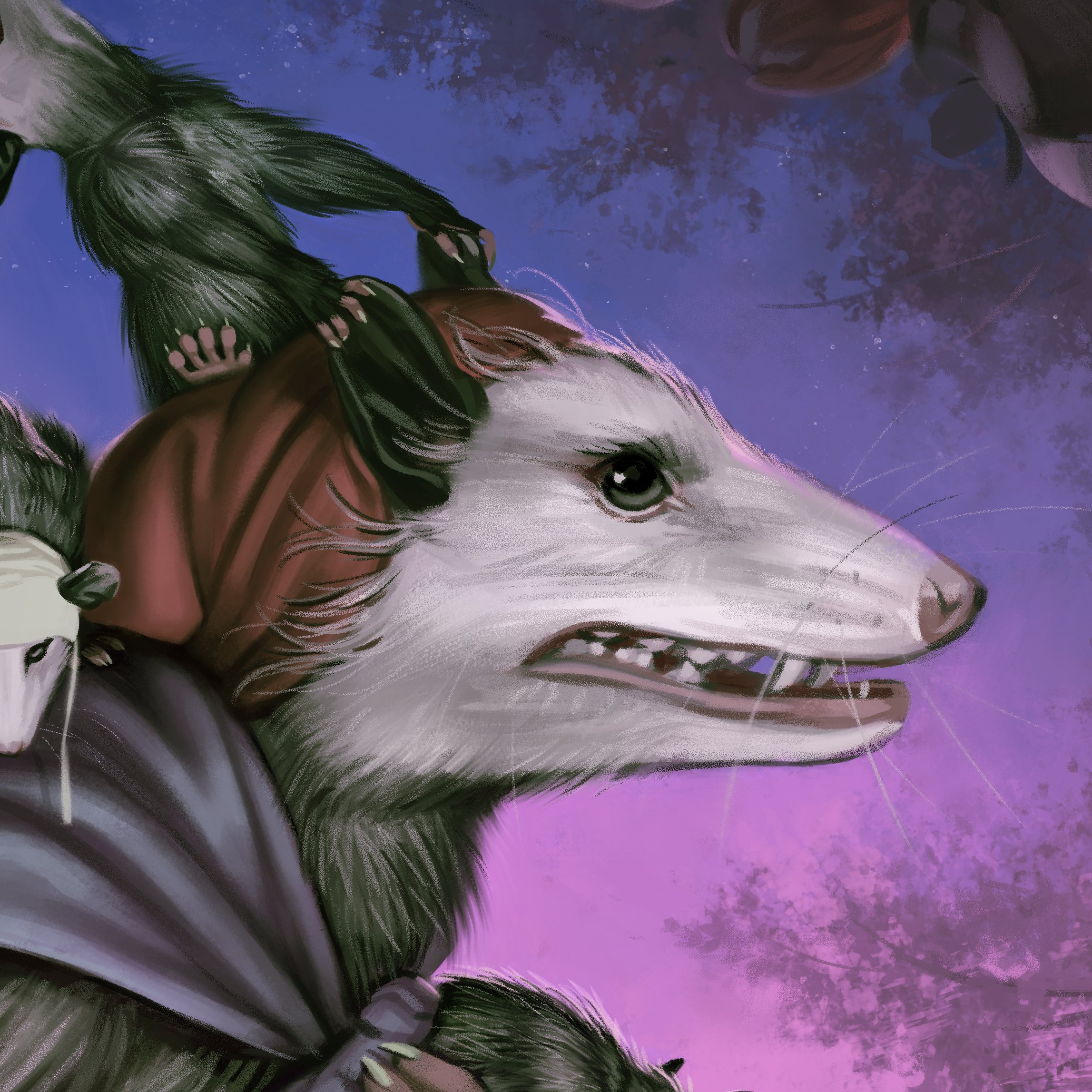
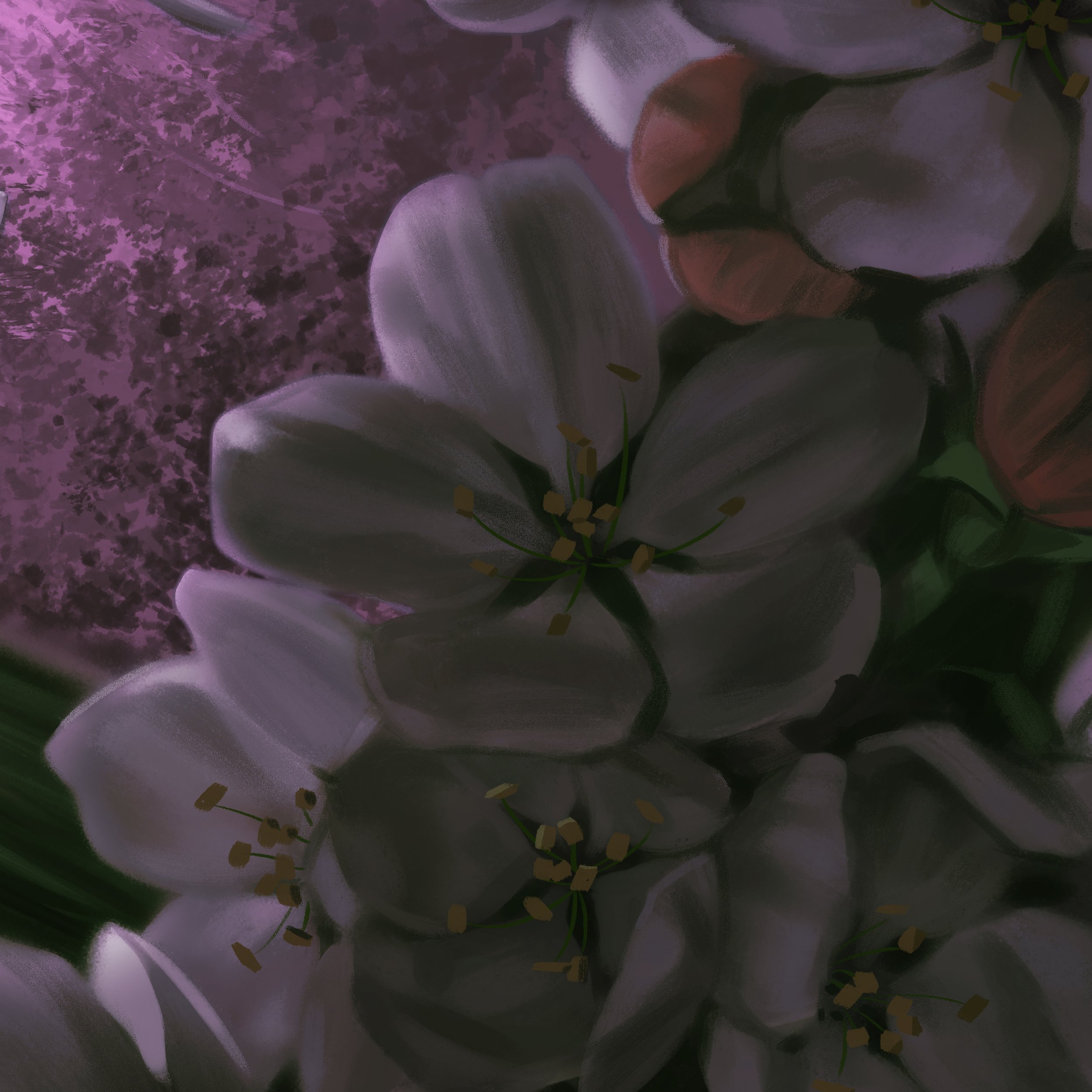
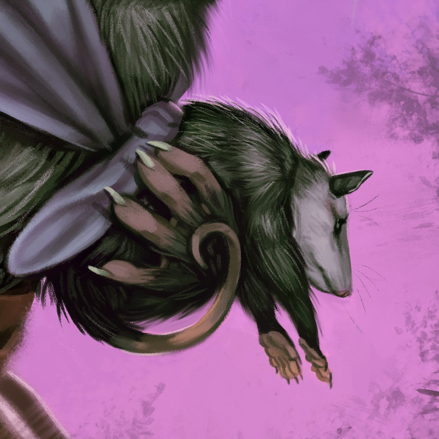
"A Possum Mom" celebrates the amazing marsupial of North America, the opossum, and moms everywhere! I kept in mind the spring timing of Mother's Day and was generous with the blossoms.

I am taking an exciting step in my art business by opening an online store integrated directly into my website! It will launch in about a week on April 24 and will coincide with some deals! I will send out a special newsletter with the launch and a special discount code.

Creating a Dramatic Backdrop

Backgrounds are sometimes an afterthought for illustrators, but they have huge narrative importance. The background gives valuable information on the story, provides the lighting situation, and helps drive the visual flow throughout the composition.

The cover I illustrated for Merrow Crescent tackles a number of visual challenges. Lets see how I got there!

The story for Merrow Crescent revolves around a girl and her encounter with unicorns (disguised as horses) at a relative's farm. There are a few must-haves for a Middle Grade cover, such as featuring the protagonist. For fantasy, depicting a magical creature or undeniably magical element is also a must. That helps me narrow down my options, which is a blessing because there are simply way too many directions to go in if we keep any and all concepts on the table.

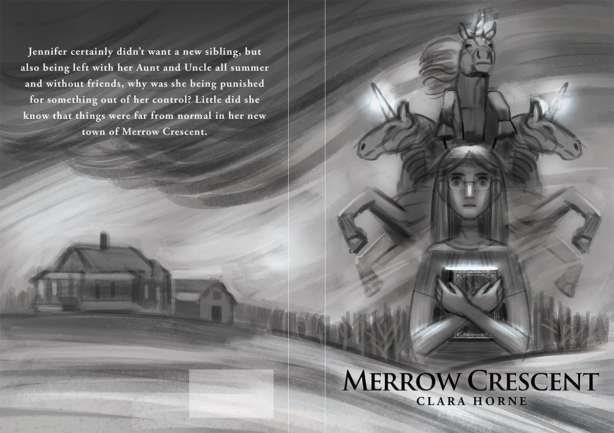
My client provided me a loose sketch beforehand which I used for the second thumbnail. The other two concepts are similar to the client's concept in that they create a contrast between the unicorn with a rural setting.

We moved forward with the second sketch to explore color schemes and typography.

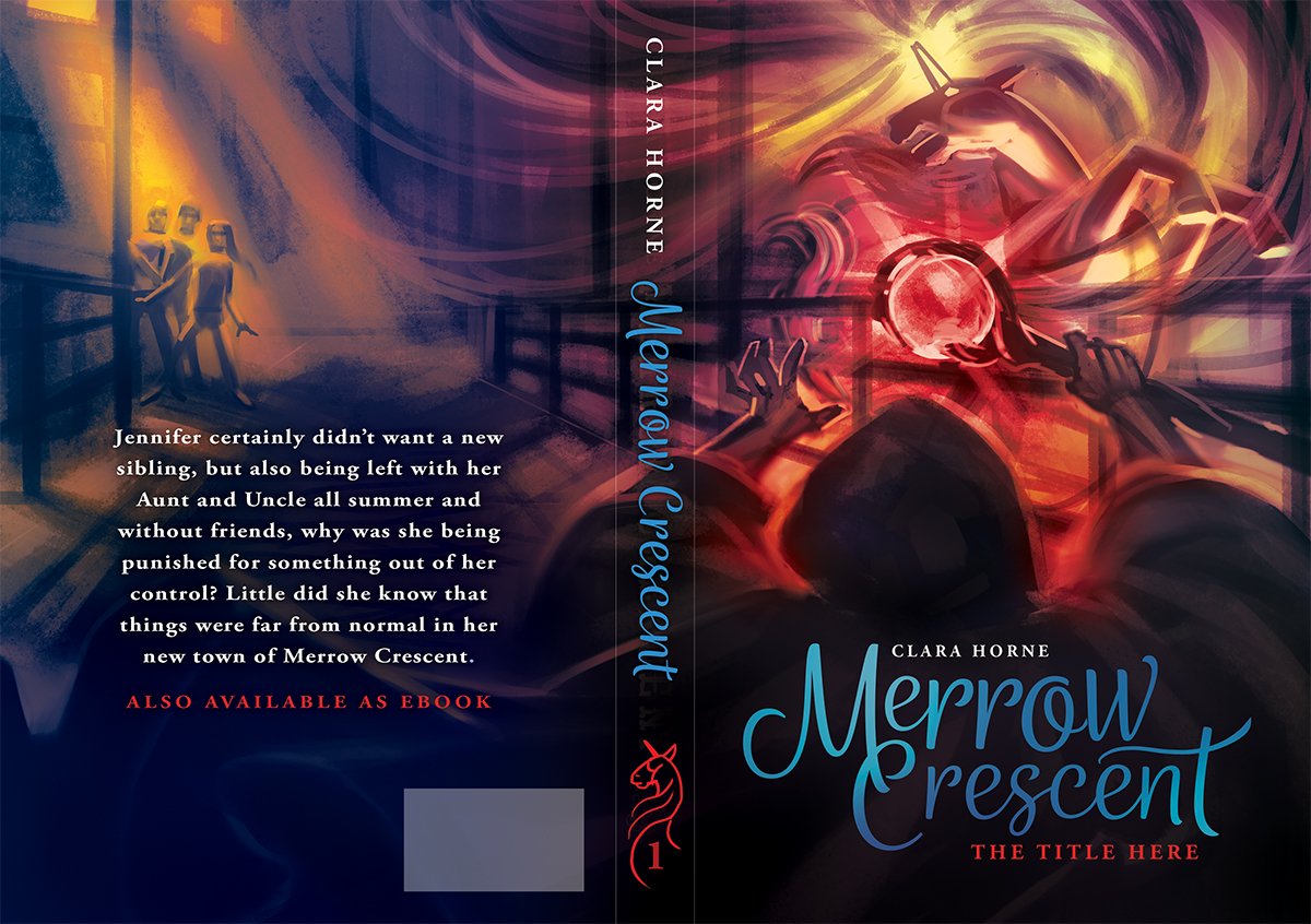
My goal for color was to bring out the hot red of the magic staff by using cooler background colors. This also informed the cool and warm color scheme for the text.

For the font style of the title text, I tried out a few whimsical swoopy fonts as well as a western style for fun to see what it would be like to hint at the rural setting with the title and motifs.

After the font and color scheme was approved, I moved forward with my reference gathering to try and recreate the complex scene from the sketch.

The reference gathering involved some hands-on 3D modeling in Blender. The first challenge was to find a 3D model with the right style of stable. I found a free model on the Google Sketchup 3D warehouse, which I customized to fit the structural and lighting needs for the artwork composition. I took the stable and duplicated it twice so that there were three long hallways to match the size of the maze-like stable described in the story. I narrowed the middle hallway that the figures occupy, otherwise they would stand too far apart on the book cover. There were a few other adjustments here and there, but the big one was making skylights, which I made using a Boolean Modifier to quickly cut out a square for each window hole. It took a little bit of trial and error to make sure the placement of the skylights and angle of lights in the 3D scene matched the sketch.

Here is the main 3D render composite that gave me invaluable information on the complex lighting. As you can see the models aren't perfect--the "wizard" doesn't have all of his fingers and the background figures are three bald amigos--but it's enough for lighting reference.

When I was playing around with the camera in Blender, I was rotating it (mostly by accident) and saw how cool the Dutch angle looked. I revised the position of the text on the back cover and ended up with what a more suspenseful image and better formatting of the text because of the tilted horizon line.

The final paperback cover and typography for Merrow Crescent!

Last Day for Holiday Gifts: December 16

Here's your heads-up for purchasing physical gifts from my Etsy store. Make sure to get in your order by December 16 to have it shipped in time. There may be some slight variations depending on your location, so you can look at the delivery estimate right on the Etsy listing. I have stickers, framed artwork, prints, and more!