Procreate continues to impress as an alternative to Photoshop. Recently, they released Procreate Dreams for animating and more professionals are starting to use this powerful software for art-making. I have been sketching here and there with Procreate, but last December gave me time for an in-depth exploration. On my Instagram, you can see a short review of brushes I tried. In this list, I will share more about specific settings I found helpful to get closer to my Photoshop brush preferences. This information is most useful to artists transitioning to Procreate from Photoshop or want to add Procreate to their workflow.
How I "Photoshopped" My Procreate Brushes:
Adjust Your Pressure Curve
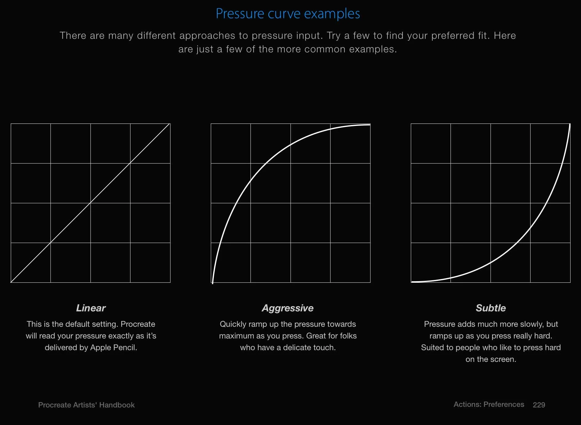
Under Actions (Tool Icon)>Prefs>Edit Pressure Curve, you will find a graph that will adjust when you click and drag it. Mine looks like a hill while the default is a straight line. I have a light touch, so the "Aggressive" pressure setting that curves upward feels more natural. In Default, the light touches I make create super faint strokes and I get a cramp from having to press harder than what is natural for me.
Try Out Custom Brushes By Like-Minded Artists
By trying out a bunch of brushes made by artists whose painting techniques were similar to me, I found better brushes and learned more about what brush settings could "fix" brushes I didn't like. Gumroad has great free and affordably priced brushes by amazing illustrators and artists.
Turn on the Azimuth Setting For Brush Tilt
In Photoshop, I have a favorite gouache brush from Kyle Webster's gouache brushes with a rectangle shape that rotates with the tilt of my pen. I found a similar brush from Jingsketch called Flat Square, but its shape was static as I rotated my pen, making it hard to use the thick vs thin edge of the brush at different angles. In Brush Settings (click the brush in Brush Library)> Shape you can toggle on the Azimuth setting and shazam, you have your brush tilt just like Photoshop.
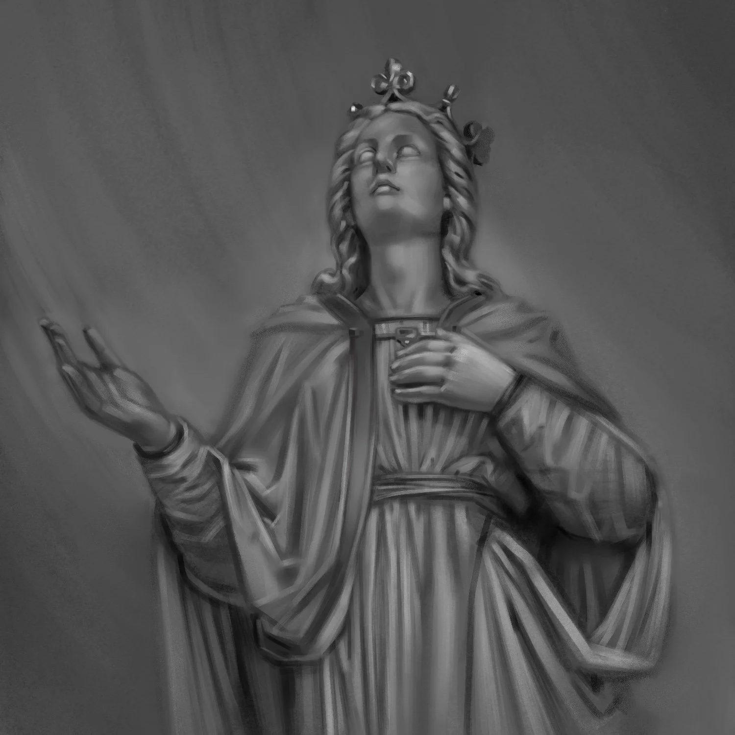
A painting study in Procreate. I mainly used Jingsketch's Basic Brushes.
Embrace the Refined Under-Drawing
One painting tip I have for Procreate is related to the size of the work area on an Ipad. An Ipad is a dramatically smaller area than what you may be used to when working in Photoshop and on top of that, your hand will be covering some of your Procreate canvas. For me, this means I zoom in more when finessing details in Procreate and do not see proportion or value issues as easily as when using a large monitor for Photoshop. A workaround for this is making a more refined drawing before proceeding to shading in Procreate. Luckily, the stroke control in Procreate make line drawing much easier than Photoshop (at least, when compared to the Graphics Tablet), so a tighter sketch in Procreate can be accomplished quickly.
I have a few more insights into Procreate for next month and the start of a new set of book covers. I'm looking forward to see how I can use the strengths of Procreate to improve my personal work and illustration freelance!


